What Is The Right Size For A Phone?
Throughout the last 25 years we have seen some interesting shifts in the dimensions of mobile phones. These changes have really come in 3 basic areas, the chassis, buttons, and screen. I find it interesting that heavy focus on one or the other has led to compromises in the other two areas. This has caused me to consider what the optimum balance of the three factors would be for the user, ignoring the priorities of the manufacturer. After all manufacturers are looking at profits and marketing, not usability.
For an interactive History of Mobile Phones 1992 to present click here.
The Chassis
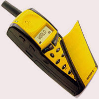
In the 90’s and early 00’s the chassis design was driven by heat dissipation and battery capacity. The phones were inefficient and analog cell phones especially generated a lot of heat. Different designs were attempted to find the right balance with the flip phone ultimately winning out in the US and candy bars winning in Europe. We also see a progression of smaller antennas as the years progress.
After 2001 users were not yet converting to the limited smartphones available, but the drive towards a modern phone had begun. With every model release the manufacturers were in an arms race to deliver more features. GPS, multimedia, wireless charging, environmental sensors, all of these pieces became standard fare. This all came at a price. The chassis began to be driven by aesthetics and design to justify higher and higher price points. You can clearly see, all the way to current flagship phones, the increases in material quality and construction. Today you can buy phones that do not need a case to survive a drop, while looking fantastic. This has not always been the case in the past.
Buttons/Keyboards/Input
From the very beginning mobile phones have primarily been, well, phones. They always tended to mimic the experience of a standard touchtone phone. Even today many people look specifically for rings and dial pads that remind them of the past. While much has changed, this still shows itself even in the most advanced phones on the market.
What has changed is how we dial. Over the years buttons have been a favorite point of experimentation for manufacturers. We have seen all of the following:
- membranes
- metal
- tiny
- oversized
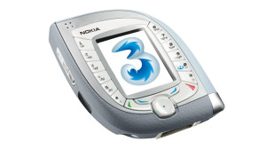
- wheels
- dials
- trackballs
- detachable
Most of these have not worked that well, but now touchscreens have universally taken over. Sure, there are a very small number of phones that still have tactile buttons, but they are a tiny portion of the market. Touch, despite being universally known to be inferior to buttons, has won the day. This is mostly due to the current primary driver of the modern phone…
Screens
Ignoring some oddball LED versions, mobile phones started with LCD monochrome displays that showed very little information. It did not take long for the innovators in companies like Nokia, Motorola, IBM, and Ericsson to see the potential. Within a few years what started as a simple necessary component became the driver of phone design.
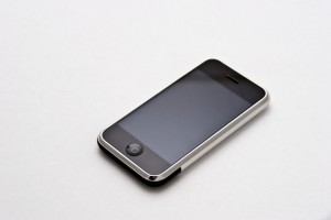
Advances in speakers, microphones and touch technology were made specifically to allow the screen to take up more of the phone. Some manufacturers have even toyed with devices that unfold with more screen or put a second screen on the back. Probably because we are visual people, phones are driven by the screen. I believe what drove the popularity of the iPhone originally was its complete dominance of the phone with a screen more than the Apple mystique or features.
The original question
 From working through all of these pieces I can see the dilemma faced by phone designers. How do you pack every feature into a phone, provide a good user interface, and the largest screen possible? Oh, and it has to be affordable but still look expensive. What a crazy set of requirements. So I am going to skip all the hard stuff and try to boil it down by the user. Many try to select a phone for women vs men. I disagree completely, phones are used universally. This is evident in the marketing of specific phones to women, it never manages to meet expectations when it comes to sales.
I believe the size and frame of the person is the most important piece of the puzzle. There are small framed people, including youth, that own phones. There are your average masses and also some rather large-framed people. This appears to me to be the correct way to design phones, marketing is a different matter altogether.
Large Frame Phablet
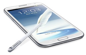
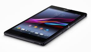
I am starting here because this is simply where the market is. The current fad is pushing the limit of what can fit in someones hand. The larger person can clearly handle a 6-6.5″ screen, hold it one hand, and put it to the ear to talk without obscuring the entire head. Our society has walked away from buttons permanently, it appears, so their is no need to accommodate those in the ideal phone.
That leaves the chassis. In a phone this large the chassis needs to be thin but manufacturers keep trading the battery life away for uber thin. This irritates users to no end. Sure, when you use your phone for the first time it lasts all day. By 3 months in it will not last if you are a heavy user, hotspotter, or frequent navigator. This is because the battery life degrades over time. Looking at phones for a long time it is obvious that a 3 day battery could easily be installed in a device this size. A large framed person could easily handle the weight and the benefits would be extraordinary.
A Real Phone for Real People
Most people are graced with a medium sized frame. This is true the world over. Yet manufacturers seem to have forgotten this segment altogether. I believe the optimum phone for this group is very easy to define. I personally have simply been listening to the large number of people I interact with regularly. I listen when they comment about their phone. The vast majority think their phone is too large for them.
It appears to me that the ideal screen size is 3-4.5″. The screen should have a very high pixel density of course, smaller should not mean lame. Today phones in this segment are cheaper, with cheap screens. Users want a premium experience in a package this size.
The other major difference is people want a phone that fits well in their hand. Super thin phones are hard to hold and they marginalize battery life. A solid well built phone that had a little thickness in this size range would be ergonomically preferable AND have the space for a proper battery.
Small Frame Phone
I know a number of small framed people. Almost universally they use their phones with two hands. When you have small hands you cannot dial with one hand on most of todays phones. I would love to see a phone that would allow these individuals the same benefits the rest of the population have. Looking through past designs I see some design elements that would really work.
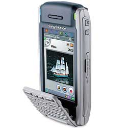
The screen needs to be in the 2.5-3″ range. The screen should probably still stick with the 16:9 aspect ratio that is common today outside of Apple products. One of the problems with smaller phones is screen real estate for media. Remembering there are multiple types of users in this space I think the ideal phone would have a removable flip button pad like the Sony Ericsson P910 from 2004. This feature would allow the large number of people who really want buttons in a touch world to have one. It would also allow smaller framed people to dial with one hand and slip the phone in a pocket or purse.
The chassis likely needs to move back to a “candy bar” still with a little more thickness. Smaller should not mean less battery life. The smaller screen will use less power but the rest of the electronics have the same power draw as any other phone. Thicker will also be easier to hold. I actually think a lot of users, of all sizes, that are users of a smartphone but do not “live” on their phone, would prefer a design like this.
Conclusion
Just going through this exercise has clarified some things for me about the space. I originally was thinking about phones for men and women, I now believe it is a frame issue and not about gender. I have also been laughing at the really large phones for some time but for larger people they are perfect. If you have huge hands and huge pockets you should have a phone with an enormous screen. Size can have an advantage. I also see some older design elements that could be quite powerful today for a smaller phone. The Nokia style candy bar with a removable flip keypad is intriguing to me. This has been enjoyable to speculate and who knows, maybe some of this might happen. For right now I am extremely satisfied with my non-carrier based Sony Xperia Z, it is even waterproof.
No comments yet.